
The flexible box layout module, often known as flexbox, makes it easier to create responsive webpages without overusing positioning and float settings. You may simply resize and relocate the flex container and its contents one-dimensionally and arrange the things to best match the space available in the container, even when the size of flex objects is unknown.
All current browsers support the CSS flexible box layout module, according to caniuse.com
CSS Flex Terms and Fundamentals
Let’s start by becoming familiar with the main phrases used most frequently in flexbox:
- Flex line: Within the flex container, flexible components are arranged along a flex line. One flex line only exists by default in a flex container.
- The main axis: The main axis is the principal axis along which the flexible parts are positioned. Based on the flex-direction parameter, this could be vertical or horizontal.
- Main-start edge and Main-end edge: Flex objects are placed in the flex container starting from the main-start edge and moving toward the main-end edge.
- Cross Axis: Axis that is parallel to the main axis is called a cross axis.
- Cross-start and cross-end edges: In the container, flex lines begin and terminate at the cross-start and cross-end edges, respectively.
Beginning With:
You must declare the container as a flex container before you can use the flexbox layout module. Take a look at the sample below.
<div class="flex-container">
   <div class="flex-item">1</div>
   <div class="flex-item">2</div>
   <div class="flex-item">3</div>
   <div class="flex-item">4</div>
   <div class="flex-item">5</div>
</div>
You must change the container’s display property to flex. Then, it automatically transforms the direct child elements of the flex container into flex items.

Flex Container Properties
Flex container settings specify how the contents inside the flexible box should be arranged by browsers. There are six attributes for flex containers. Let’s go over each one:
- Flex-direction: Indicates the direction the flexible elements inside the flexible container should be placed. A single-direction layout concept is a flexbox. As a result, the flex elements can only be stacked in horizontal rows or vertical columns. There are four choices for the flex-direction property:
- row (by default): Stacks the flexible elements left to right in a horizontal row.
- column: Arranges the adjustable items in a vertical stack, top to bottom.
- row-reverse: Reverses the order of a row, stacking flex components from right to left.
- column-reverse: Vertically stack flex elements from bottom to top.

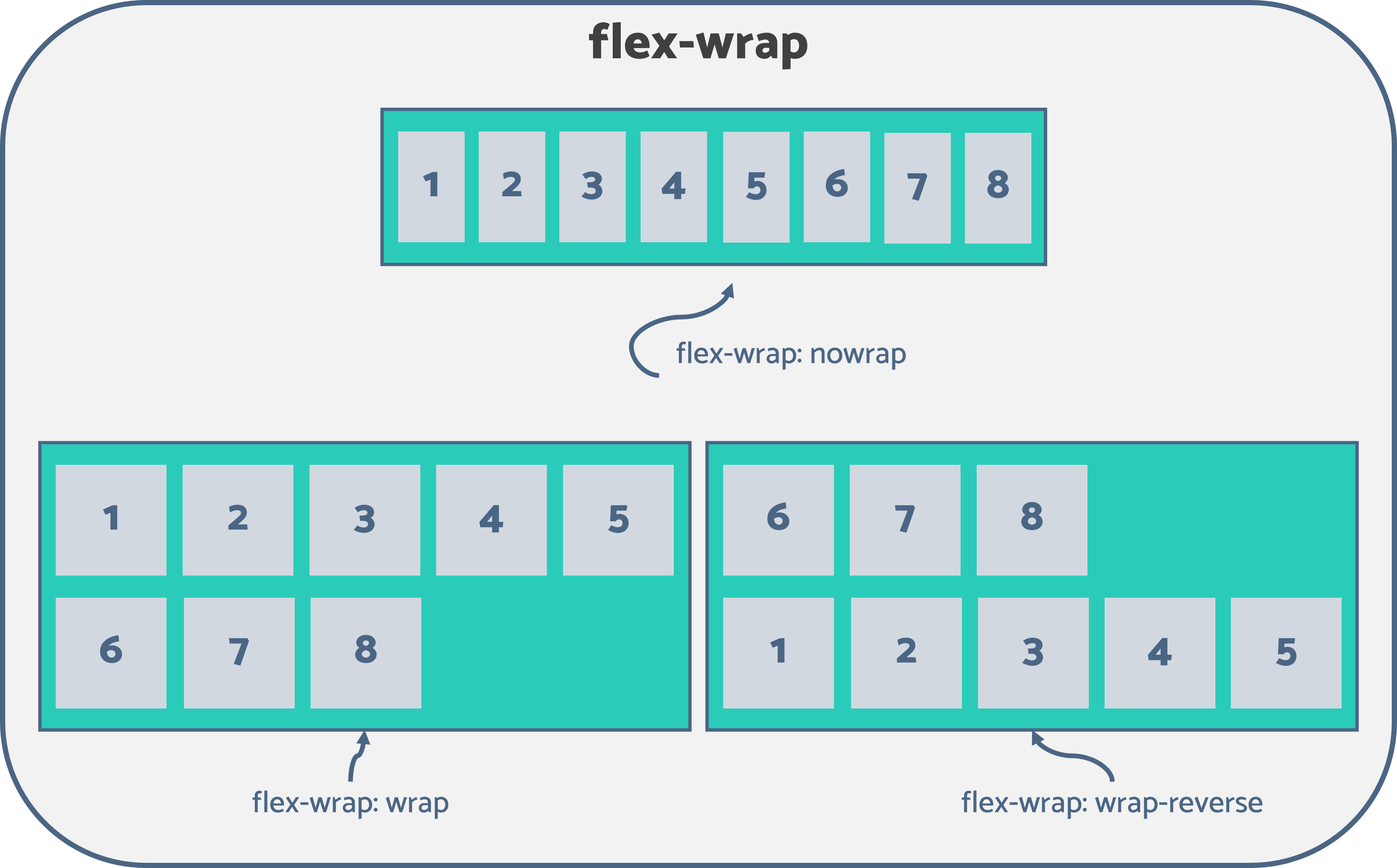
- flex-wrap: Flex elements will attempt to fit onto a single line by default. Hence, if all of the flex items’ combined height (or width) is larger than the flexbox’s height, the extra items will spill out of the container (or width). Flex-wrap determines whether or not the flex items that are overflowing should be wrapped across multiple lines. The following three values are acceptable for the flex-wrap property:
- nowrap(by default): the default nowrap prohibits wrapping flex elements and mandates that every item be placed on a single line. Flex items may overflow from the container as a result of this.
- wrap: If necessary, splits the flex components onto numerous lines.
- wrap-reverse: Similar in operation as wrap, but with the reversed order.
- flex-flow: Flex-flow is a shortcut property used to set both the flex-direction and flex-wrap attributes at once. See the following code illustration.
.flex-container {
  display: flex;
  flex-direction: row-reverse;
  flex-wrap: wrap;
}
Alternatively, you can use the following:
.flex-container {
  display: flex;
  flex-flow: row-reverse wrap;
}
- justify-content: Use justify-content to indicate the browser how to position the flex elements along the main axis of the flexbox. It specifies how the area around and between the flexible elements is distributed along the container’s principal axis. The following values can be used with this property:
- flex-start (by default): aligns the flex items with the main-start edge of the flexbox’s main axis.
- flex-end: aligns the flex items to the main-end edge of the flexbox’s main axis.
- center: Along the primary axis of the flexbox, flexible objects are centered.
- space-around: By allotting the same amount of space to each of an item’s sides, flex items are spread uniformly around the primary axis. Here, the region is half as wide as the distance between the two items as compared to the space between the main-start (or main-end) boundary of the container and the first (or last) flex item.
- space-between: This technique evenly spaces each adjacent flexible item by aligning the first item to the main-start edge and the last item to the main-end edge of the main axis.
- space-evenly: Flex objects are spread evenly along the main axis within the container. The distance between the first (or final) flex item and the container’s main-start (or main-end) edge equals the gap between each successive pair of items.

- align-items: With the align-items property, you can indicate the browser where to place the flex items relative to the flexbox’s cross-axis. Although perpendicular to the main axis, it behaves similarly to justify-content in terms of behavior. These are the acceptable values for this property:
- stretch (by default): Stretches the flex items while keeping in mind the height and width restrictions to fill the vertical area of the container (default).
- center: The flex elements are aligned to the center of the container, or more specifically, to the center of the container’s cross-axis, by using the center command.
- flex-start: Place the flex items on the cross-start edge. The top of the container is therefore vertically aligned with flexible components.
- flex-end: Aligns the flex items at the cross-end edge using the flex-end command. This indicates that flexible components are vertically aligned at the container’s base.
- baseline: Places the flex elements at the cross-baseline axis.

- align-content: When there is sufficient space in the main axis, it behaves similarly to justify-content in aligning flex items there. Nevertheless, align-content positions the flex lines along the cross-axis instead of the items and instructs the browser how to do so. This property accepts the following values:
- stretch (by default): evenly divides the leftover space among the flex lines to fill the vertical area.
- space-between: The first and last flex lines are, respectively, aligned to the cross-start and cross-end edges of the container in order to generate equal space between each pair of lines between the first and last lines.
- space-evenly: Flex items are equally distributed by assigning even space above the first line, between two flex lines, and below the last line.
- space-around: adds a same amount of space around each line, similar to Space-Evenly. As a result, the space between the first and last lines is half as wide as the space between the first and last lines.
- flex-start: Each flex line will only fill the space it need before advancing toward the container’s cross-start edge.
- flex-end: Each line only fills the space it need before moving toward the cross-end edge of the container.
- center: The flex lines are aligned to the center of the container’s cross-axis and are comparable to flex-start and flex-end.

Note: single-line flex containers cannot be used with align-content. The flexbox needs to be a multiline container with the flex-wrap attribute set to wrap or wrap-reverse in order for it to work.
Flex Item Properties
Flex item properties specify how a particular item should be displayed within the flexible box by browsers. The six different flex container attributes are as follows. As we go through them:
- order: By default, flex items are positioned according to the HTML code’s definition of the order. The order in which the flex items should appear in the flex container is determined by the order parameter. The value, which must be a number, is always 0 by default.

Review the previous illustration. To switch the first and last entries, I changed the order property values to 5 and 1, respectively.
Note: Rearranging the HTML code will help avoid confusing users of the HTML content. Only utilize the order property if it is truly necessary.
- flex-grow: Specifies how much a flex item should expand in relation to other flex items in the same container in order to take up any extra space. The default value is 0, and the value must be unitless. The remaining space in the flexbox will be divided equally among all items if the flex-grow attribute is set to an equal value for all flex items.

- flex-shrink: Specifies how much a flex item should contract in relation to the other flex items when the container is full. The initial value is 1.

- Flex-basis: Specifies a flex item’s beginning length.
- Flex is a shortcut property that can be used to simultaneously set the flex-grow, flex-shrink, and flex-basis values. Flex: 0 1 auto is the default.
- Note: flex: initial (default) equals flex: 0 1 auto, flex: auto equals flex: 1 1 auto, flex: none equals flex: 0 0 auto, and flex: inherit, as the name implies, inherits the flex property values of its parent element.
- align-self: Similar to the align-items property, align-self performs the same function. Nevertheless, just one flexible item is affected by the align-self, not all of the flexible items in the container. Also, it overrides the align-items attribute to specify the alignment of a chosen item within the flexbox.

Conclusion
This post included all the information about the flexbox layout module you require to build a responsive website layout. It is crucial to recognize its limitations, though. The flexbox layout functions admirably for pages, but it requires greater flexibility in large and complicated apps, particularly when growing, shrinking, stretching, or changing orientation.
Also Read: Telegram new update released with a number of new features